


Lingo
Scale consistently.
Company
Lingo
Timeline
Jun. 2015 -> Nov. 2016
Role
Product Designer
Visit
About
Lingo App is a Los Angeles-based tech startup focusing on digital asset management (DAM). It offers a platform for teams and organizations to efficiently organize, store, and share various digital assets like images, videos, and documents. The platform aims to enhance efficiency, maintain brand consistency, and enable seamless collaboration within organizations.
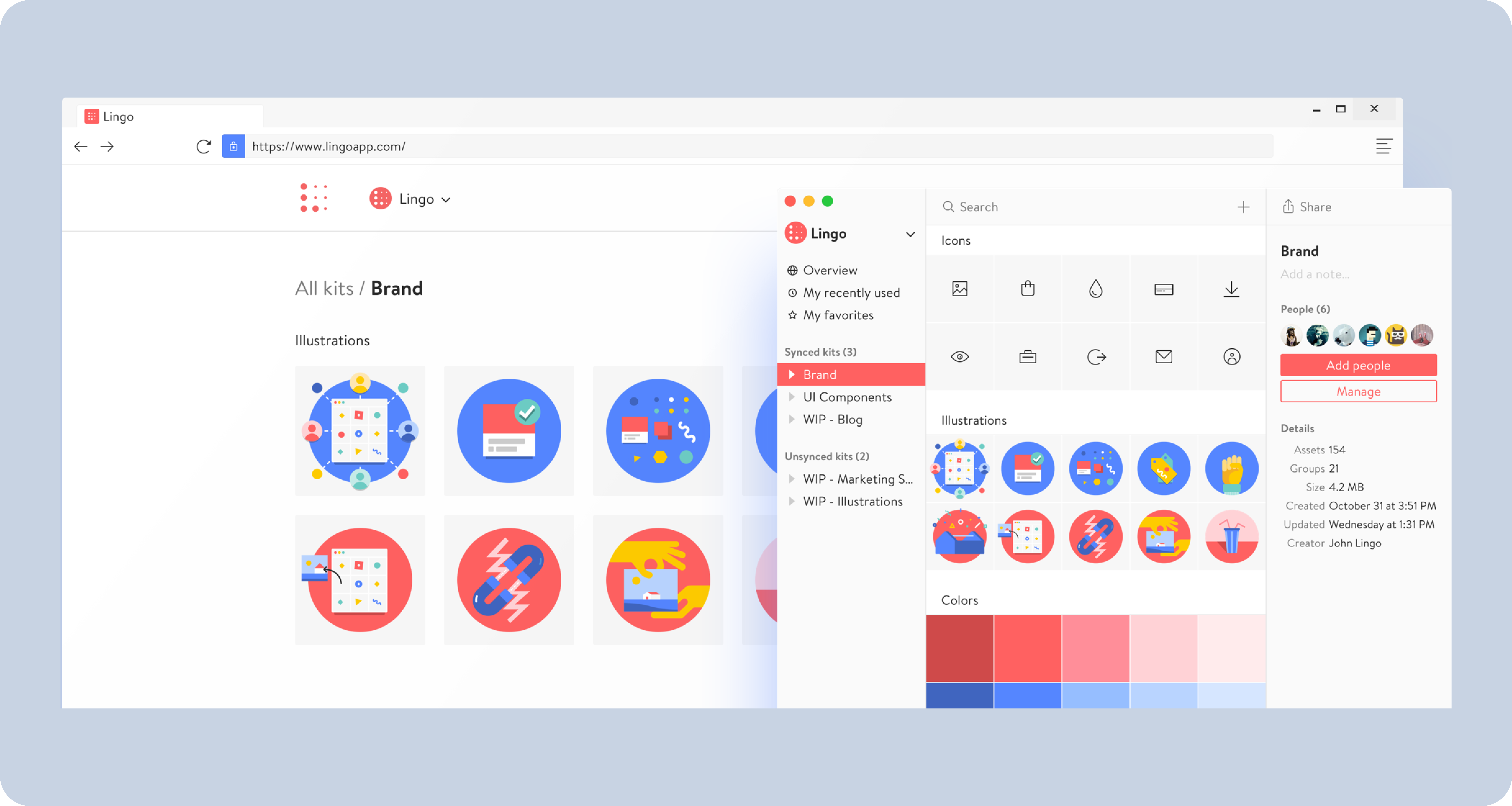
Lingo web and native Mac app
During my time at Lingo, a startup born from within the Noun Project in Los Angeles, CA, I had the privilege of contributing to a groundbreaking platform that simplified the sharing, management, and scalability of visual language for design and product teams.

Jamming on our internal hack-a-thon that would lead to Lingo
Lingo emerged from an internal hackathon held during the summer of 2015 at Noun Project. Over the subsequent eight months, we embarked on the remarkable journey of building an entirely new startup within the framework of Noun Project, leveraging evidence-based approaches and continuous research. In the spring of 2016, we proudly launched Lingo, reimagining the way design teams discovered, organized, and shared their visual language within their organizations and beyond.
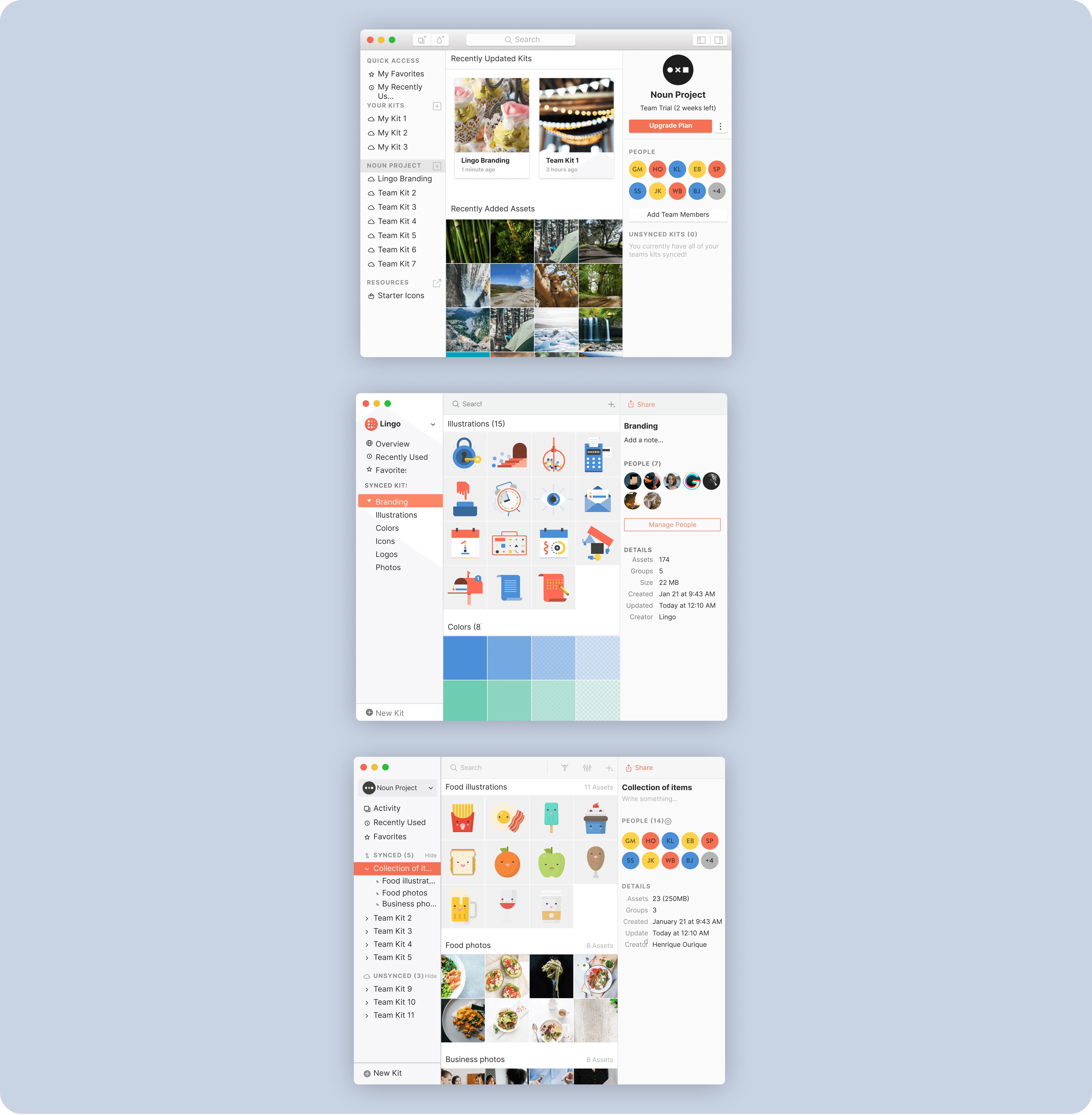
Lingo app evolution

Lingo "Add color" flow
Throughout my work at Lingo, I played a pivotal role in conducting research with our early adopters. This research served as the foundation for designing the core user experience, interactions, and visual design of the Lingo Mac application. I focused not only on the app itself but also on enhancing the sign-up and onboarding experiences, ensuring a seamless and intuitive user journey.

Lingo "Sign up" flow
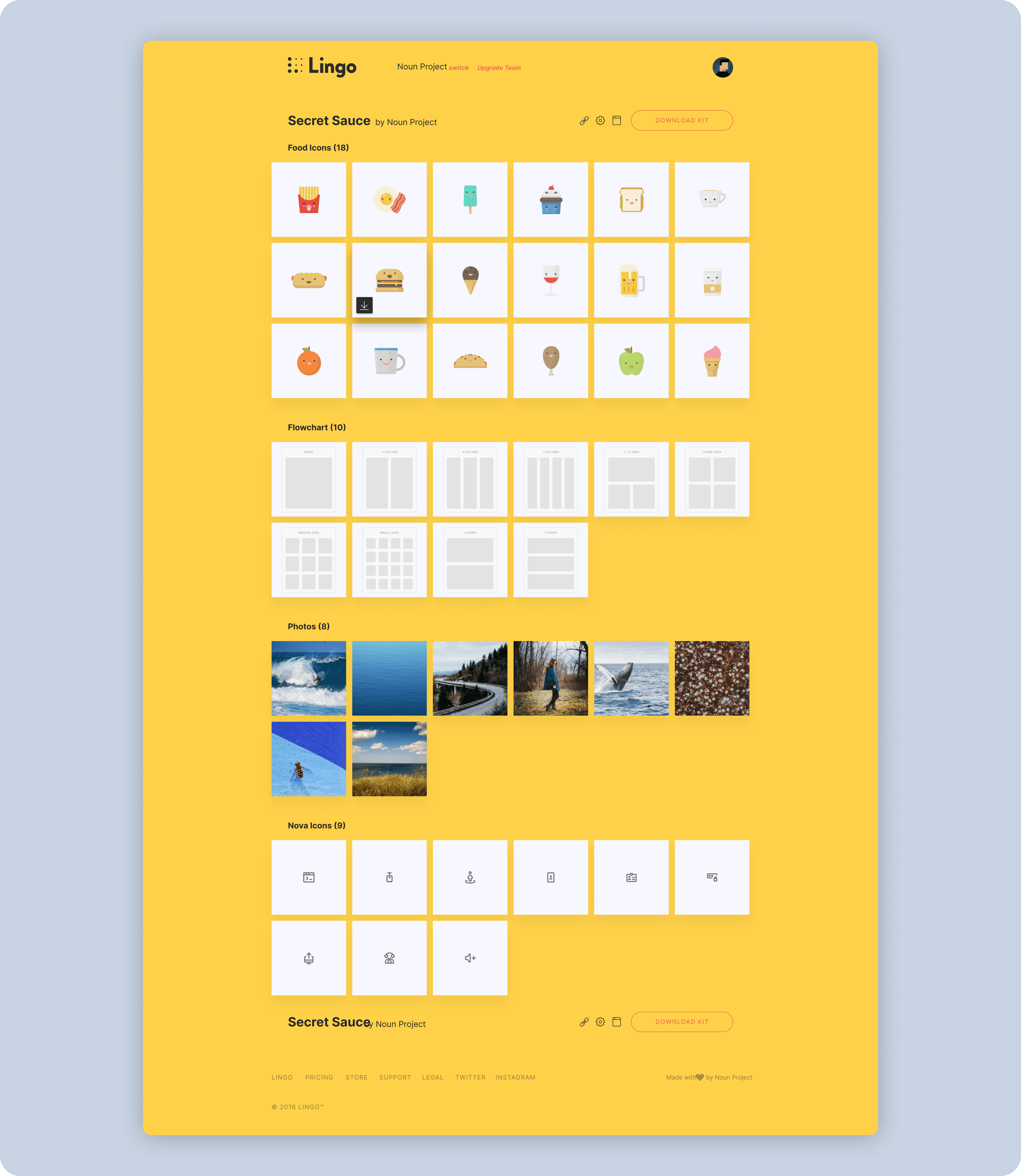
Lingo web view (early designs)
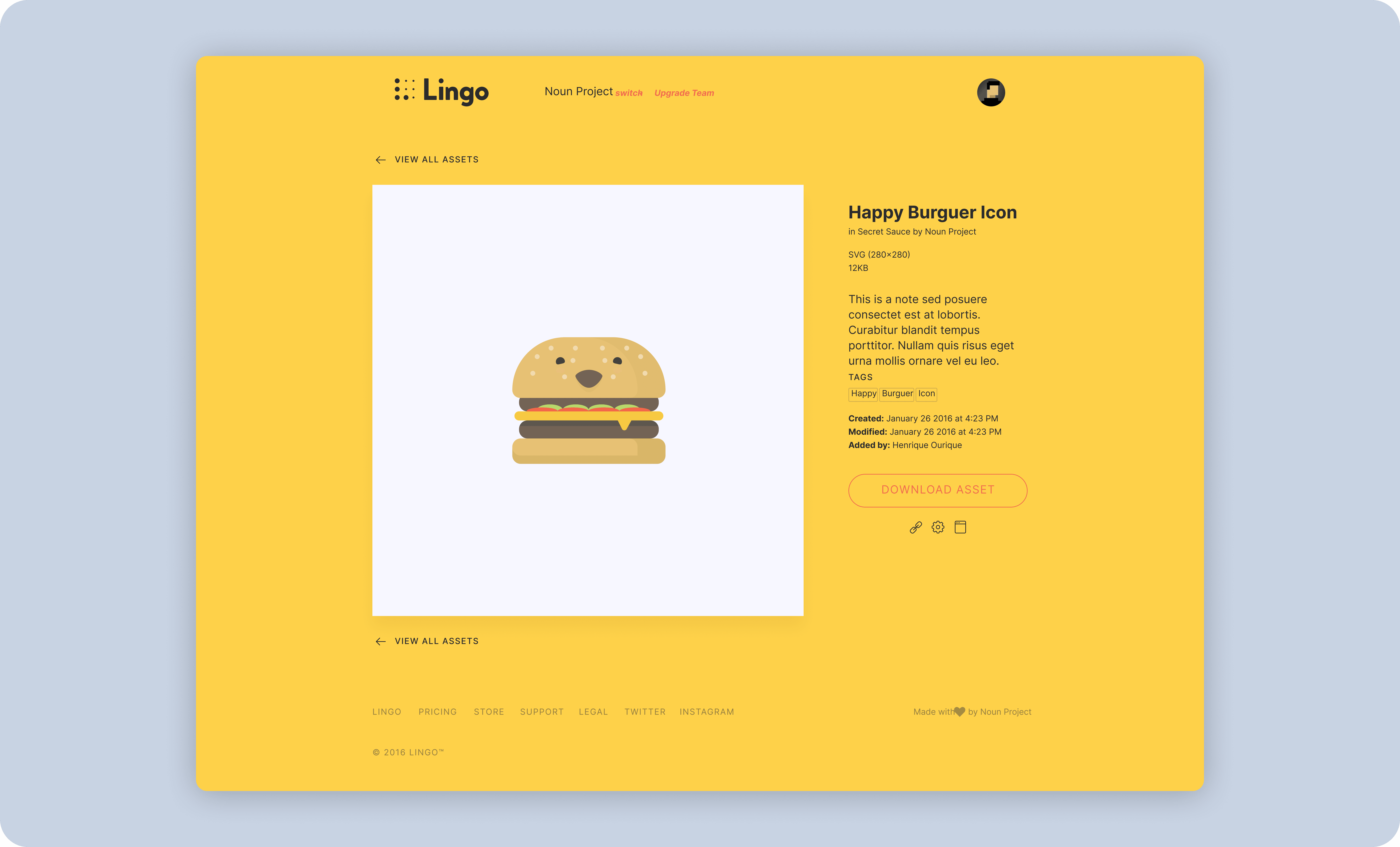
Lingo web view (early designs)
Additionally, I had the privilege of collaborating closely with the executive team at Lingo to implement a strategic direction that prioritized teams within product-driven companies. This involved aligning our product roadmap, marketing efforts, and customer acquisition strategies with the specific needs and challenges faced by design and product teams in such organizations.
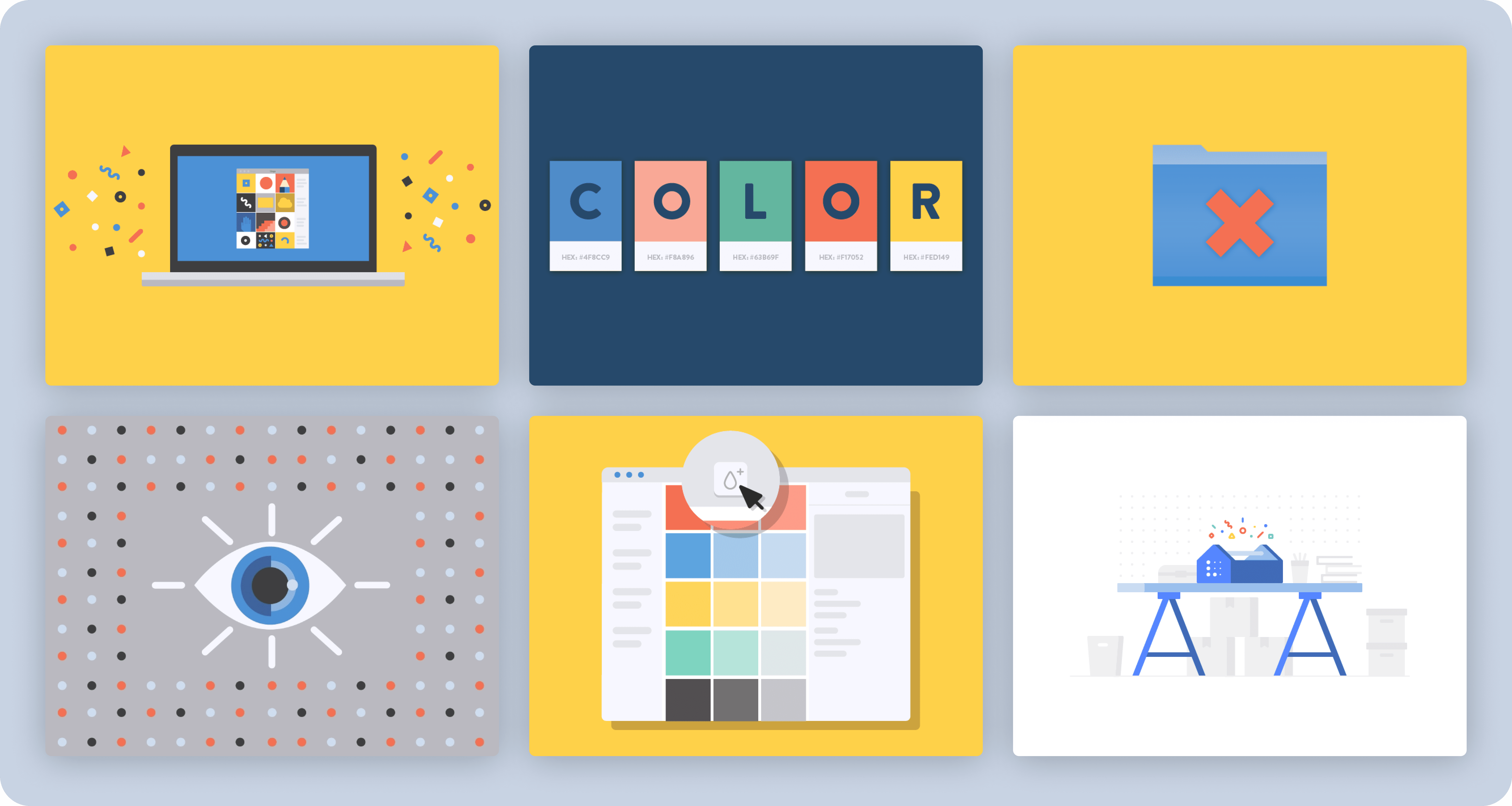
Collection of illustrations for Lingo's marketing

Lingo web and native Mac app
During my time at Lingo, a startup born from within the Noun Project in Los Angeles, CA, I had the privilege of contributing to a groundbreaking platform that simplified the sharing, management, and scalability of visual language for design and product teams.

Jamming on our internal hack-a-thon that would lead to Lingo
Lingo emerged from an internal hackathon held during the summer of 2015 at Noun Project. Over the subsequent eight months, we embarked on the remarkable journey of building an entirely new startup within the framework of Noun Project, leveraging evidence-based approaches and continuous research. In the spring of 2016, we proudly launched Lingo, reimagining the way design teams discovered, organized, and shared their visual language within their organizations and beyond.

Lingo app evolution

Lingo "Add color" flow
Throughout my work at Lingo, I played a pivotal role in conducting research with our early adopters. This research served as the foundation for designing the core user experience, interactions, and visual design of the Lingo Mac application. I focused not only on the app itself but also on enhancing the sign-up and onboarding experiences, ensuring a seamless and intuitive user journey.

Lingo "Sign up" flow

Lingo web view (early designs)

Lingo web view (early designs)
Additionally, I had the privilege of collaborating closely with the executive team at Lingo to implement a strategic direction that prioritized teams within product-driven companies. This involved aligning our product roadmap, marketing efforts, and customer acquisition strategies with the specific needs and challenges faced by design and product teams in such organizations.

Collection of illustrations for Lingo's marketing

Lingo web and native Mac app
During my time at Lingo, a startup born from within the Noun Project in Los Angeles, CA, I had the privilege of contributing to a groundbreaking platform that simplified the sharing, management, and scalability of visual language for design and product teams.

Jamming on our internal hack-a-thon that would lead to Lingo
Lingo emerged from an internal hackathon held during the summer of 2015 at Noun Project. Over the subsequent eight months, we embarked on the remarkable journey of building an entirely new startup within the framework of Noun Project, leveraging evidence-based approaches and continuous research. In the spring of 2016, we proudly launched Lingo, reimagining the way design teams discovered, organized, and shared their visual language within their organizations and beyond.

Lingo app evolution

Lingo "Add color" flow
Throughout my work at Lingo, I played a pivotal role in conducting research with our early adopters. This research served as the foundation for designing the core user experience, interactions, and visual design of the Lingo Mac application. I focused not only on the app itself but also on enhancing the sign-up and onboarding experiences, ensuring a seamless and intuitive user journey.

Lingo "Sign up" flow

Lingo web view (early designs)

Lingo web view (early designs)
Additionally, I had the privilege of collaborating closely with the executive team at Lingo to implement a strategic direction that prioritized teams within product-driven companies. This involved aligning our product roadmap, marketing efforts, and customer acquisition strategies with the specific needs and challenges faced by design and product teams in such organizations.

Collection of illustrations for Lingo's marketing

Lingo web and native Mac app
During my time at Lingo, a startup born from within the Noun Project in Los Angeles, CA, I had the privilege of contributing to a groundbreaking platform that simplified the sharing, management, and scalability of visual language for design and product teams.

Jamming on our internal hack-a-thon that would lead to Lingo
Lingo emerged from an internal hackathon held during the summer of 2015 at Noun Project. Over the subsequent eight months, we embarked on the remarkable journey of building an entirely new startup within the framework of Noun Project, leveraging evidence-based approaches and continuous research. In the spring of 2016, we proudly launched Lingo, reimagining the way design teams discovered, organized, and shared their visual language within their organizations and beyond.

Lingo app evolution

Lingo "Add color" flow
Throughout my work at Lingo, I played a pivotal role in conducting research with our early adopters. This research served as the foundation for designing the core user experience, interactions, and visual design of the Lingo Mac application. I focused not only on the app itself but also on enhancing the sign-up and onboarding experiences, ensuring a seamless and intuitive user journey.

Lingo "Sign up" flow

Lingo web view (early designs)

Lingo web view (early designs)
Additionally, I had the privilege of collaborating closely with the executive team at Lingo to implement a strategic direction that prioritized teams within product-driven companies. This involved aligning our product roadmap, marketing efforts, and customer acquisition strategies with the specific needs and challenges faced by design and product teams in such organizations.

Collection of illustrations for Lingo's marketing
My experience at Lingo allowed me to be at the forefront of transforming how design teams discovered, organized, and shared visual assets and design systems. By combining user research, intuitive user experiences, and strategic alignment, Lingo became a powerful platform that empowered design and product teams to streamline their workflows and elevate their visual language to new heights.
My experience at Lingo allowed me to be at the forefront of transforming how design teams discovered, organized, and shared visual assets and design systems. By combining user research, intuitive user experiences, and strategic alignment, Lingo became a powerful platform that empowered design and product teams to streamline their workflows and elevate their visual language to new heights.
My experience at Lingo allowed me to be at the forefront of transforming how design teams discovered, organized, and shared visual assets and design systems. By combining user research, intuitive user experiences, and strategic alignment, Lingo became a powerful platform that empowered design and product teams to streamline their workflows and elevate their visual language to new heights.
© 2024 Portfolio by Skye Selbiger
© 2024 Portfolio by Skye Selbiger
© 2024 Portfolio by Skye Selbiger
© 2024 Portfolio by Skye Selbiger
© 2024 Portfolio by Skye Selbiger
© 2024 Portfolio by Skye Selbiger
Previous work experiences
Previous work experiences


